

UICategories, the next step is to connect them to Blueprint logic inside BP_Settings. This module covers how the connection pattern works and walks through wiring the two slider controls — Horizontal move and Vertical move — to the Cube’s transform.
How the connection pattern works
Every operator control is wired with the same three-step structure inside the EventGraph ofBP_Settings:
Find Control by Name
xrlive_UIpanel component and call Find Control by Name, passing the exact name of the control as declared in UICategories. Internally, this node searches the control array and returns a Widget Controller Object Reference for that specific control.Assign the event (bind)
Find Control by Name, call the assign node that matches the control type — for sliders this is Assign On Slider Value. Connect a custom event to its Event pin. This registers the custom event as the handler that runs every time the operator moves the slider.Handle the value in the custom event
Step 1 — Wire the Horizontal Move slider
OpenBP_Settings and go to the EventGraph tab.
1.1 — Call Find Control by Name
In the Components panel, drag the xrlive_UIpanel component into the EventGraph to create a reference node. Drag off its output pin, search for Find Control by Name, and select it. In the Name field of the node, type the control name exactly as declared —Horizontal move.
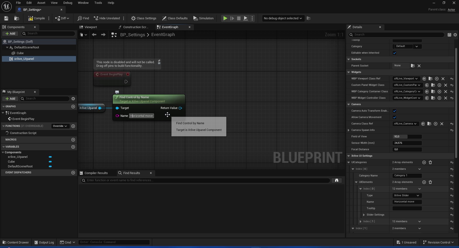
Find Control by Name — target set to xrlive_UIpanel, name field filled with Horizontal move
1.2 — Bind the slider event
Drag off the Return Value pin ofFind Control by Name and search for Assign On Slider Value. Select it. This creates both the bind node and a connected Custom Event node automatically.
Rename the custom event to something descriptive — for example, OnSliderValue_HorizontalMove.
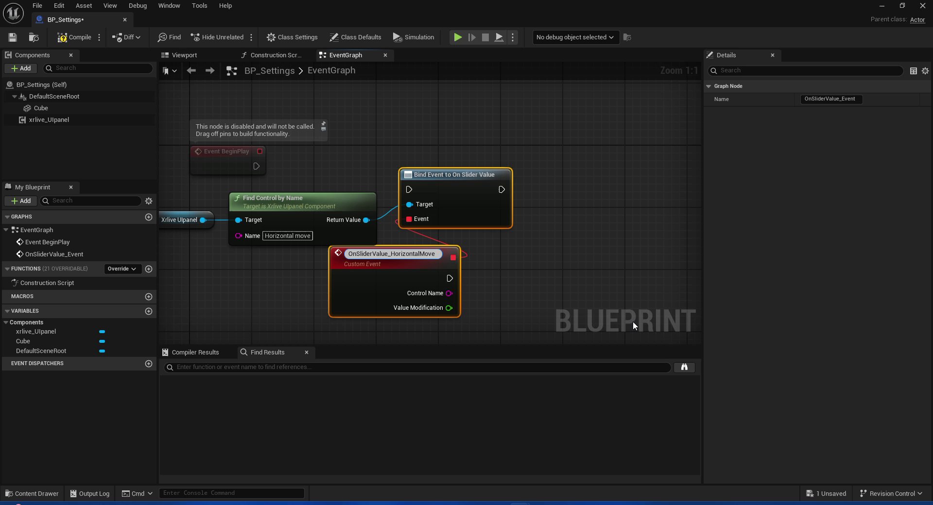
Bind Event to On Slider Value — custom event connected and named
- Control Name — the string identifier of the control that triggered the event
- Value Modification — the current float value of the slider (between Min Value and Max Value as set in UICategories)
1.3 — Drive the Cube’s X position
Drag the Cube component from the Components panel into the EventGraph. Drag off its output pin and search for Set Relative Location. Right-click the New Location pin ofSet Relative Location and choose Split Struct Pin — this exposes X, Y, and Z as individual float inputs.
Connect Value Modification from the custom event to New Location X.
To preserve the current Y and Z positions when only X changes, drag the Cube component again, call Get Relative Location, split that struct as well, and connect Relative Location Y → New Location Y and Relative Location Z → New Location Z.
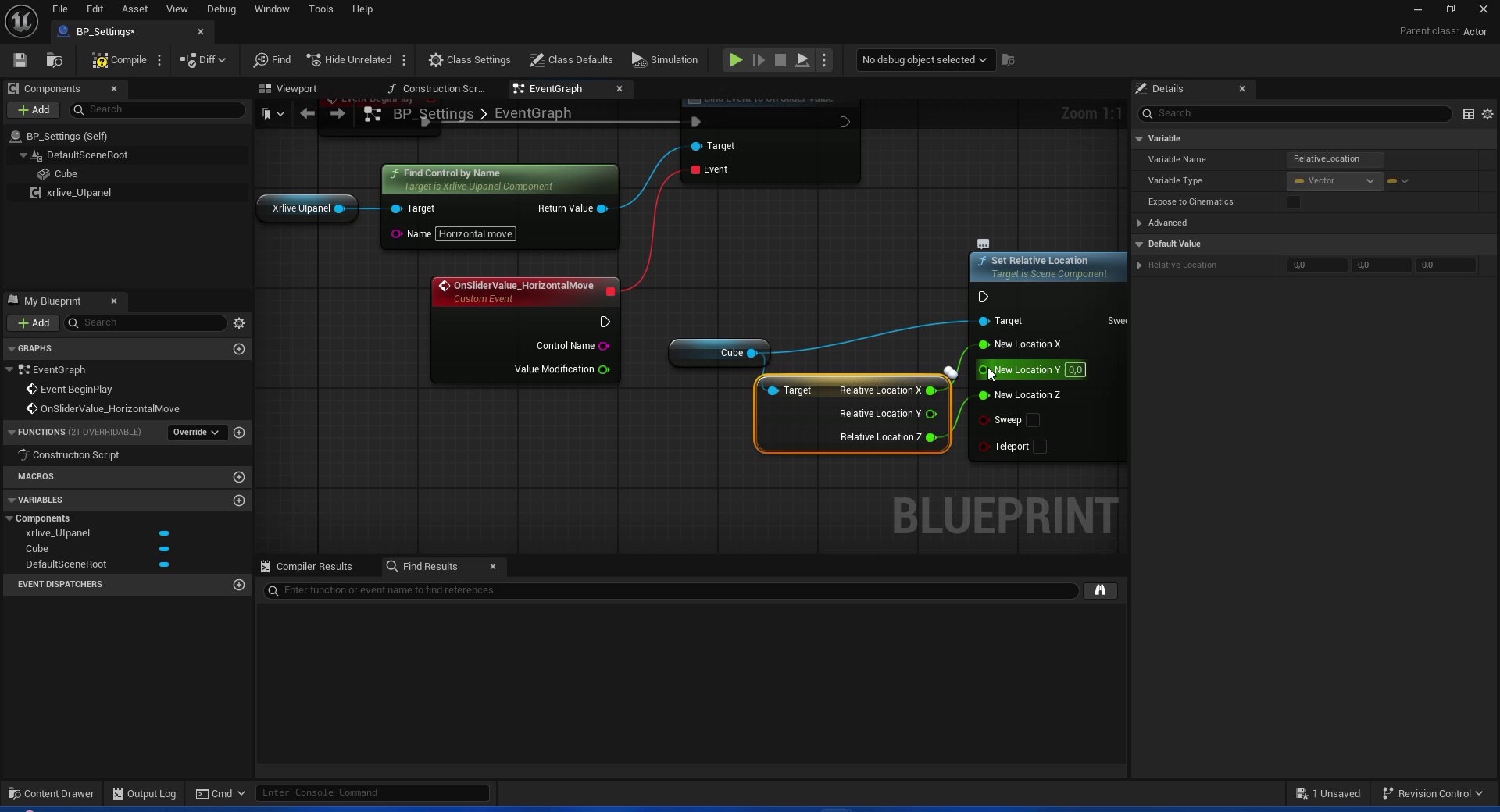
Horizontal move fully wired — Value Modification drives New Location X, Y and Z preserved from current position
Step 2 — Wire the Vertical Move slider
The Vertical Move slider follows the exact same pattern, with two differences: the control name isVertical move and the value drives New Location Y instead of X.
2.1 — Add a second Find Control by Name
Dragxrlive_UIpanel into the EventGraph again. Call Find Control by Name and set the Name to Vertical move.
2.2 — Bind Assign On Slider Value
Drag off Return Value and search for Assign On Slider Value. When the context menu appears, select Assign On Slider Value from the Events section.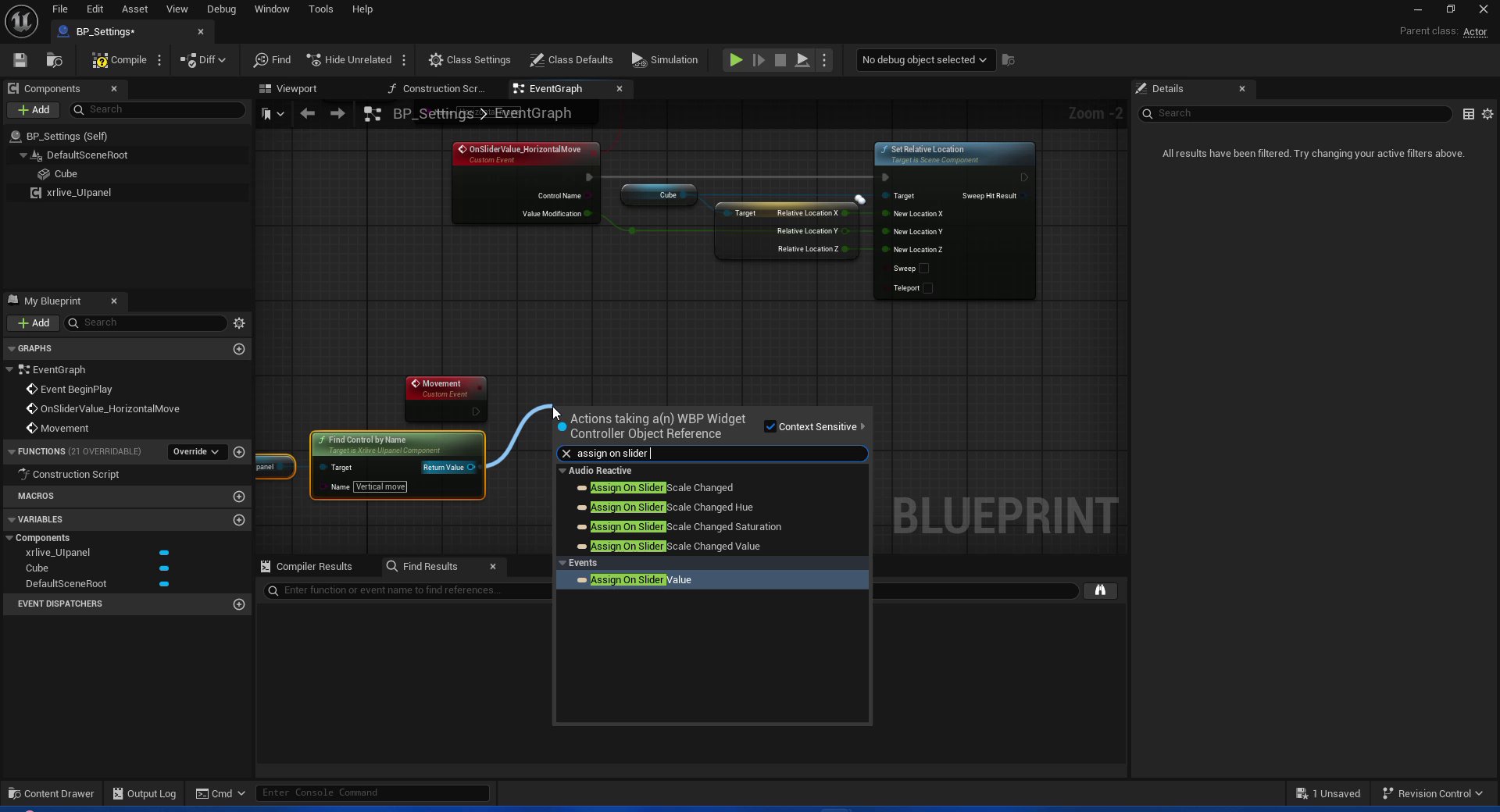
Assign On Slider Value search — select the Events entry, not the Audio Reactive variants
OnSliderValue_VerticalMove.
2.3 — Drive the Cube’s Y position
Repeat theSet Relative Location setup: split the struct, connect Value Modification → New Location Y, and preserve X and Z from the current relative location.
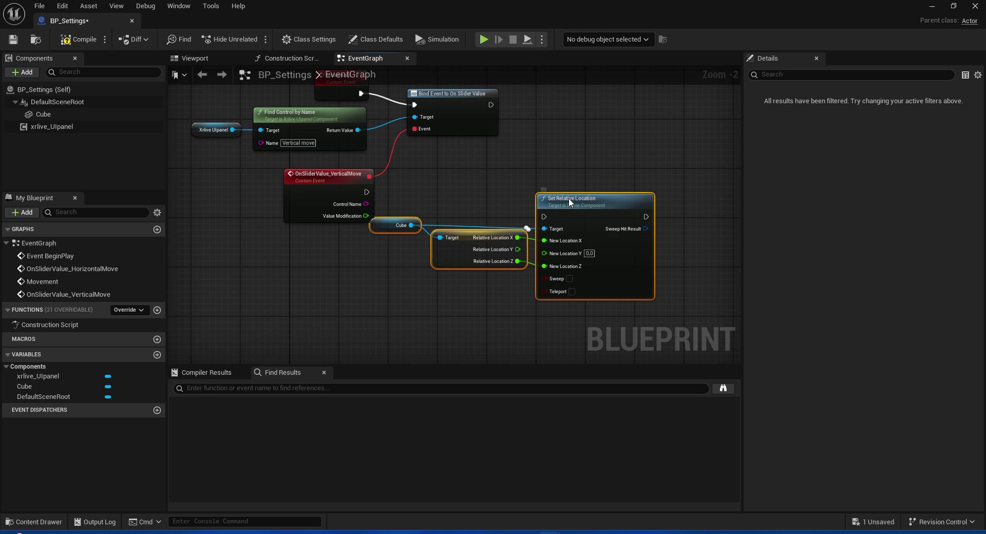
Vertical move fully wired — Value Modification drives New Location Y
Step 3 — Wire the Visibility checkbox
The checkbox uses the same base pattern —Find Control by Name → bind node → custom event — but the assign node and output pins differ from sliders.
3.1 — Call Find Control by Name
Dragxrlive_UIpanel into the EventGraph. Call Find Control by Name and set the Name field to Visibility.
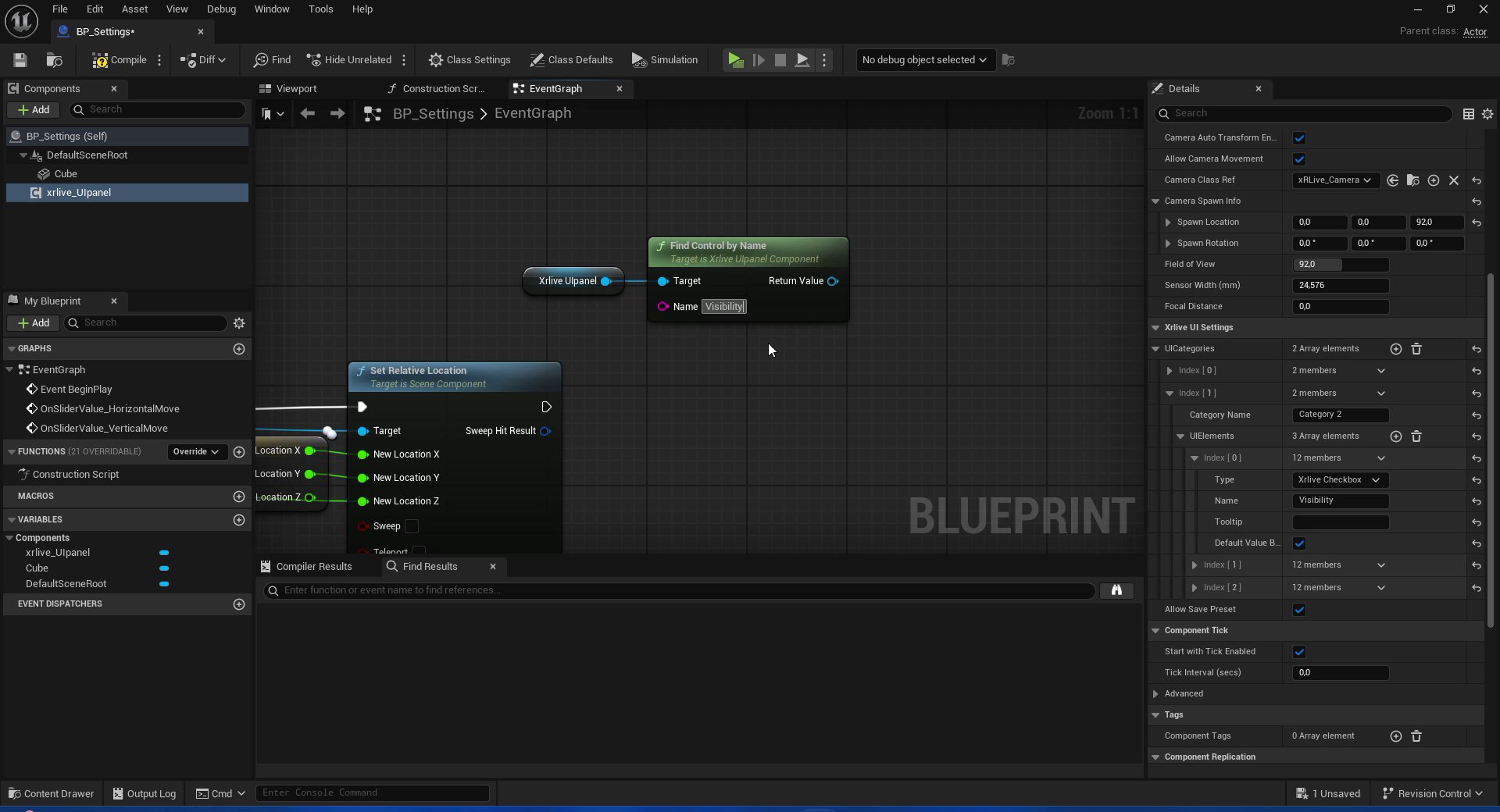
Find Control by Name — name field set to Visibility, Details panel confirms Xrlive Checkbox type
3.2 — Bind the checkbox event
Drag off the Return Value pin and search for Bind Event to On Check Change. Select it. A custom event node is created automatically. Rename the custom event toOnCheckChange_Visibility.
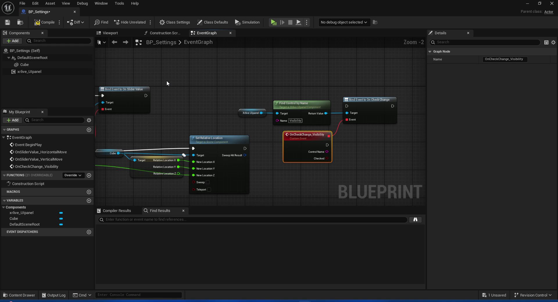
Bind Event to On Check Change — custom event OnCheckChange_Visibility connected to the Event pin
- Control Name — the string identifier of the control
- Checked — a boolean:
truewhen the checkbox is checked,falsewhen unchecked
3.3 — Invert the value and drive Set Hidden in Game
The checkbox is labeled Visibility — when it is checked the Cube should be visible. However, Set Hidden in Game expects the inverse:true means hidden, false means shown. To reconcile these, a NOT Boolean node is placed between Checked and New Hidden.
Drag the Cube component into the EventGraph and call Set Hidden in Game.
Between the custom event and Set Hidden in Game:
- Drag off the Checked pin and search for NOT Boolean. Select it.
- Connect the output of NOT to the New Hidden pin of
Set Hidden in Game. - Connect the Cube reference to the Target pin of
Set Hidden in Game. - Connect the execution pin from the custom event to the execution pin of
Set Hidden in Game.
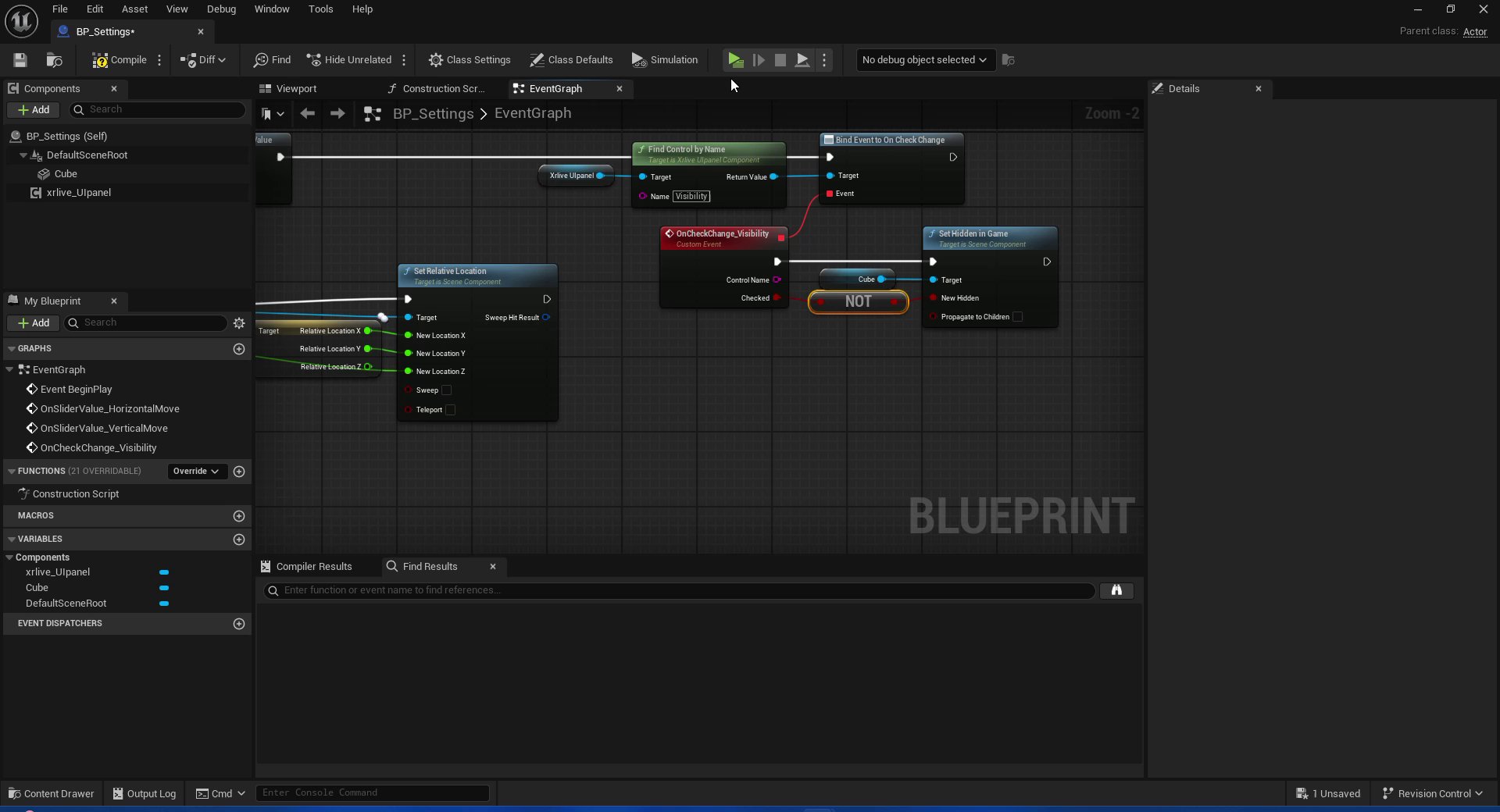
Visibility fully wired — Checked passes through NOT Boolean before reaching Set Hidden in Game on the Cube
Step 4 — Wire the Color control
The color control requires an extra step before touching the EventGraph: the Cube needs a material that accepts a dynamic color at runtime. In Unreal Engine, this is done by creating a Dynamic Material Instance from a material that has a Vector Parameter exposed.4.1 — Create the material
In the Content Browser, navigate to the plugin’s Materials folder (or create one). Right-click → Material, name itM_MeshMat, and open it.
Inside the Material Graph:
- Right-click on an empty area and search for Vector Parameter. Place one.
- In the Details panel set Parameter Name to
Color. - Connect the output pin of the
Colornode to the Base Color input of the material output node. - Press Apply and Save.
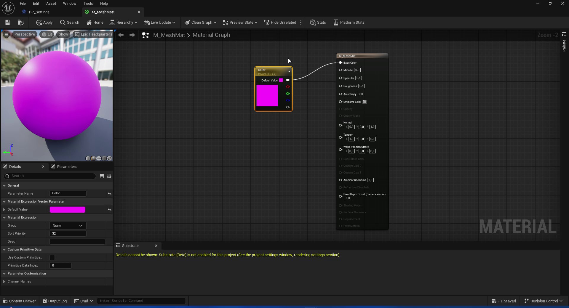
M_MeshMat material graph — Color Vector Parameter connected to Base Color, default value shown as pink
Color must match exactly the string used later in the Set Vector Parameter Value node. Any difference in casing or spacing will cause the color change to have no effect at runtime.4.2 — Set up the BeginPlay chain
OpenBP_Settings and go to the EventGraph. This chain runs once at startup to create the dynamic material instance and apply it to the Cube.
After the existing BeginPlay logic (or branching from Event BeginPlay):
- Add Create Dynamic Material Instance. Set Parent to
M_MeshMat. - Drag the Return Value pin, promote it to a variable, and name the variable
MaterialRef. This stores the instance so it can be accessed from the color event handler. - Add Set Material targeting the Cube component. Connect:
Cube→ TargetMaterialRefGET → Material- Leave Element Index at
0.
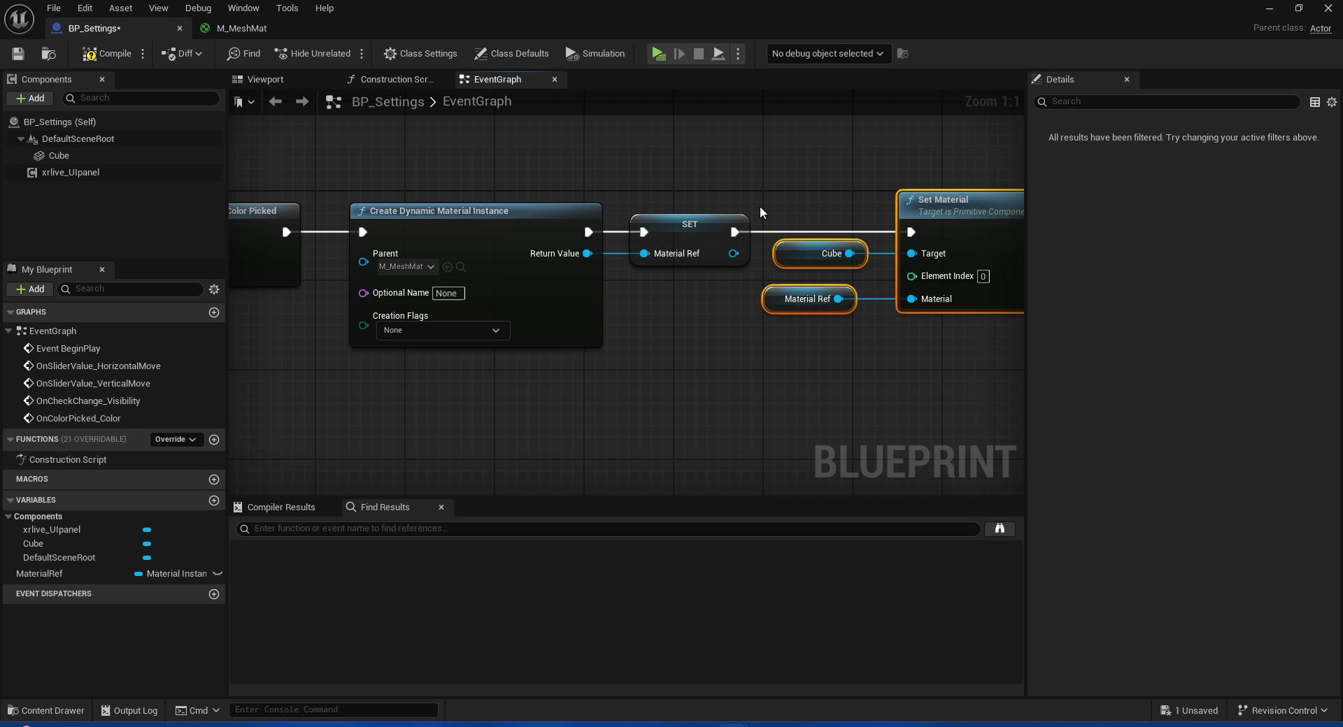
BeginPlay chain — Create Dynamic Material Instance stores the result in MaterialRef, then Set Material applies it to the Cube
4.3 — Bind the color event and wire Set Vector Parameter Value
Still in the BeginPlay chain, add the binding for the color control. After the existingFind Control by Name / Bind Event calls:
- Drag
xrlive_UIpanelinto the EventGraph. Call Find Control by Name and set Name toColor. - From Return Value, search for Bind Event to On Color Picked. Select it. A custom event
OnColorPicked_Coloris created withControl NameandColor(LinearColor) output pins.
OnColorPicked_Color custom event:
- Drag the MaterialRef variable into the EventGraph to create a GET node.
- From MaterialRef, search for Set Vector Parameter Value. Select it.
- Set Parameter Name to
Color. - Connect the Color output pin of the custom event to the Value input of
Set Vector Parameter Value.
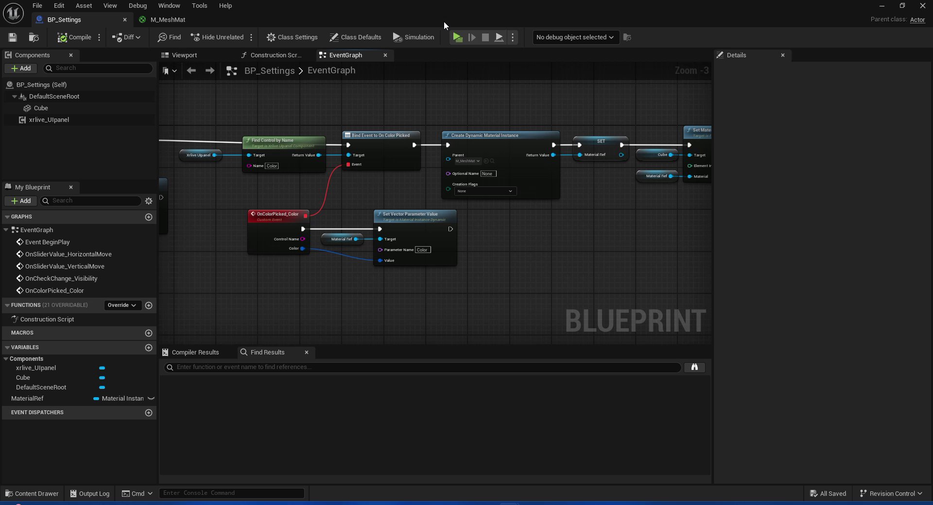
Complete EventGraph — top row is the BeginPlay chain (bind + create DMI + set material), bottom row is the color event handler (MaterialRef → Set Vector Parameter Value)
Step 5 — Wire the Shape dropdown
The dropdown differs from the other controls in how the event value is handled: instead of driving a single property, theSelected Item string is used to branch execution with a Switch on String node, and each branch applies a different Static Mesh to the Cube.
5.1 — Bind the dropdown event
Fromxrlive_UIpanel, call Find Control by Name and set Name to Shape. Drag off Return Value and search for Bind Event to On Dropdown Selection. The custom event OnDropdownSelection_Shape is created with Control Name and Selected Item (String) output pins.
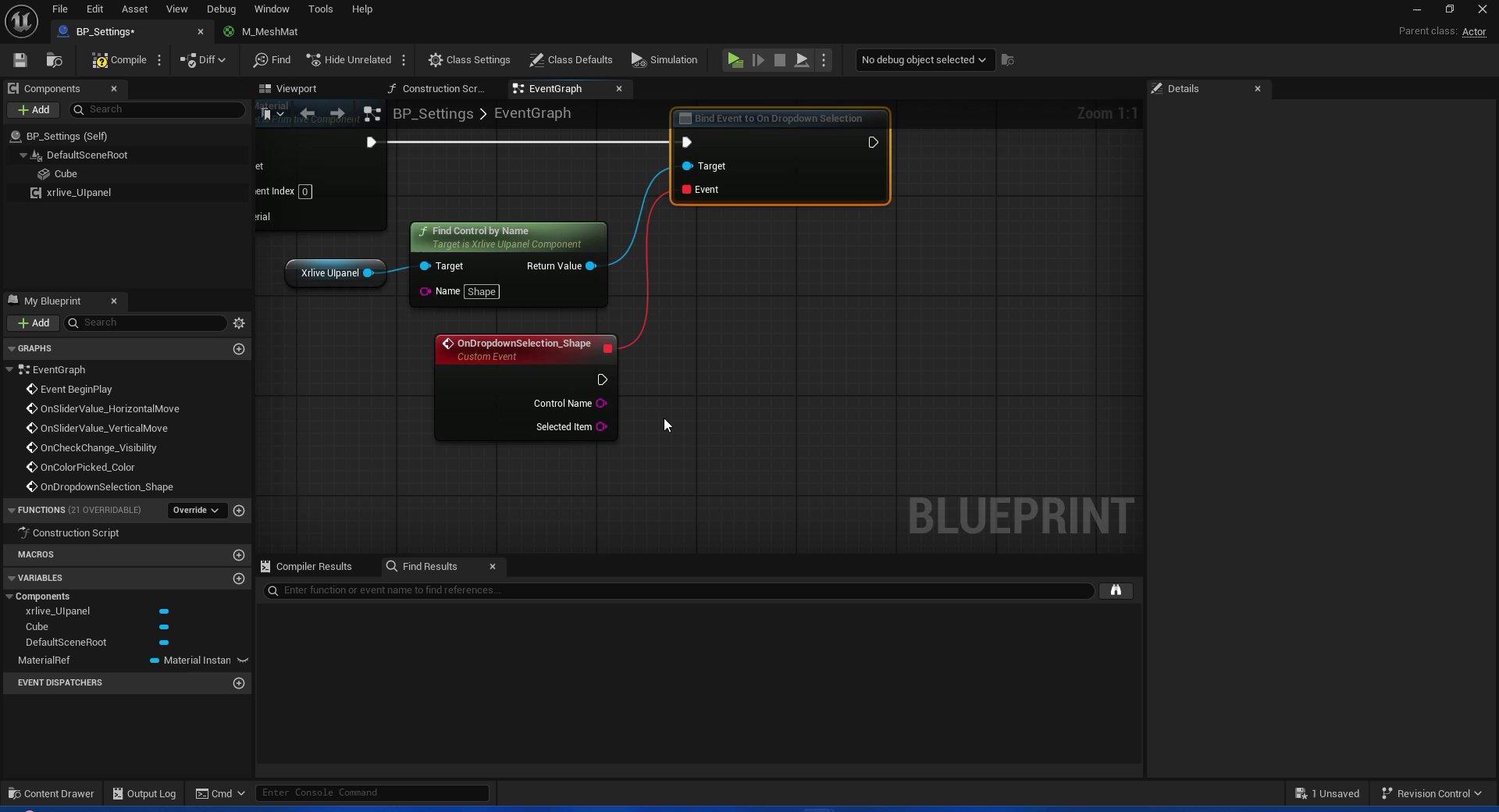
Bind Event to On Dropdown Selection — custom event OnDropdownSelection_Shape connected, Selected Item output pin visible
5.2 — Create a NewMesh variable
In the My Blueprint panel, create a new variable namedNewMesh of type Static Mesh. This variable will temporarily hold the mesh chosen in each switch branch before it is applied to the Cube.
5.3 — Route selection with Switch on String
Drag off the Selected Item pin and search for Switch on String. This node creates a separate execution output for each string value you define. Click Add pin three times and name the cases exactly as declared inUICategories: Cube, Sphere, Cylinder.
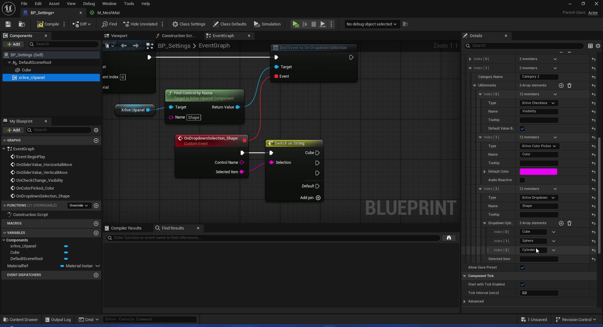
Switch on String — three cases matching the dropdown options, Default pin left disconnected
UICategories. A mismatch will cause that branch to never fire and the Default pin to trigger instead.5.4 — Assign the mesh for each case
For each case pin, drag the NewMesh variable as a SET node and assign the corresponding Static Mesh asset fromEngine/BasicShapes:
Cubepin → SET NewMesh =Engine/BasicShapes/CubeSpherepin → SET NewMesh =Engine/BasicShapes/SphereCylinderpin → SET NewMesh =Engine/BasicShapes/Cylinder
5.5 — Apply the mesh with Set Static Mesh
Connect the execution output of all three SET nodes to a single Set Static Mesh node targeting the Cube component. Add a NewMesh GET node and connect it to the New Mesh input ofSet Static Mesh.
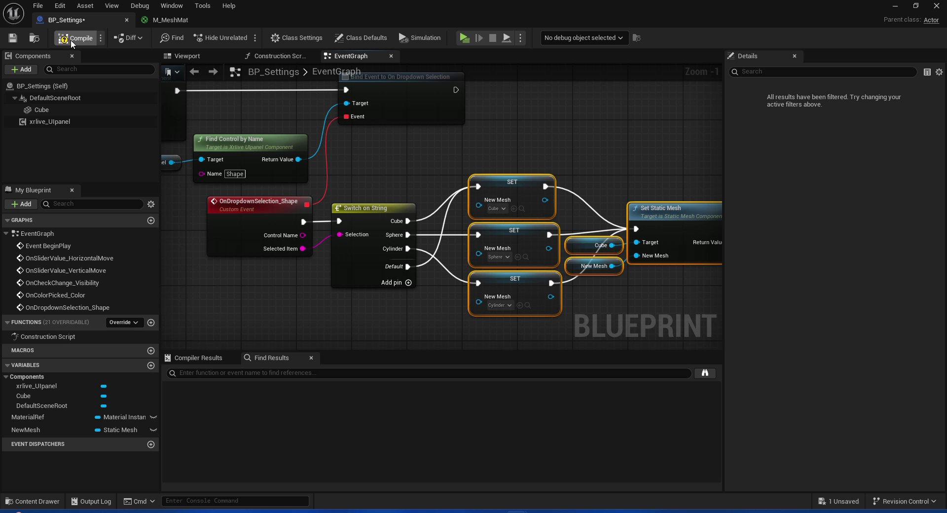
Shape dropdown fully wired — Switch on String fans out to three SET NewMesh nodes, all converging on a single Set Static Mesh call on the Cube
What you have now
All five controls from Category 2 are fully wired:- Horizontal move →
Set Relative Location, X axis - Vertical move →
Set Relative Location, Y axis - Visibility →
Set Hidden in Gameon the Cube (inverted through NOT Boolean) - Color →
Set Vector Parameter Valueon a Dynamic Material Instance applied to the Cube - Shape →
Set Static Meshon the Cube, switching between Cube / Sphere / Cylinder from Engine BasicShapes