

BP_Settings and xrlive_UIpanel in place, this module covers how to declare the operator controls that will appear in the xRLive panel. All controls are defined inside the UICategories array in the xrlive_UIpanel Details panel — no Blueprint code is needed at this stage.
This module only covers declaring controls. Connecting them to Blueprint logic (so they actually move, hide, or recolor the shape) is covered in the next module, Wire Slider Controls.
How UICategories is structured
UICategories is an array of categories. Each category has:
- A Category Name — the label that appears as a tab or section header in the operator panel
- A UIElements array — the list of controls inside that category
UIElements has a Type dropdown that determines which kind of control it is, a Name that the operator sees, an optional Tooltip, and type-specific settings (range for sliders, options for dropdowns, etc.).
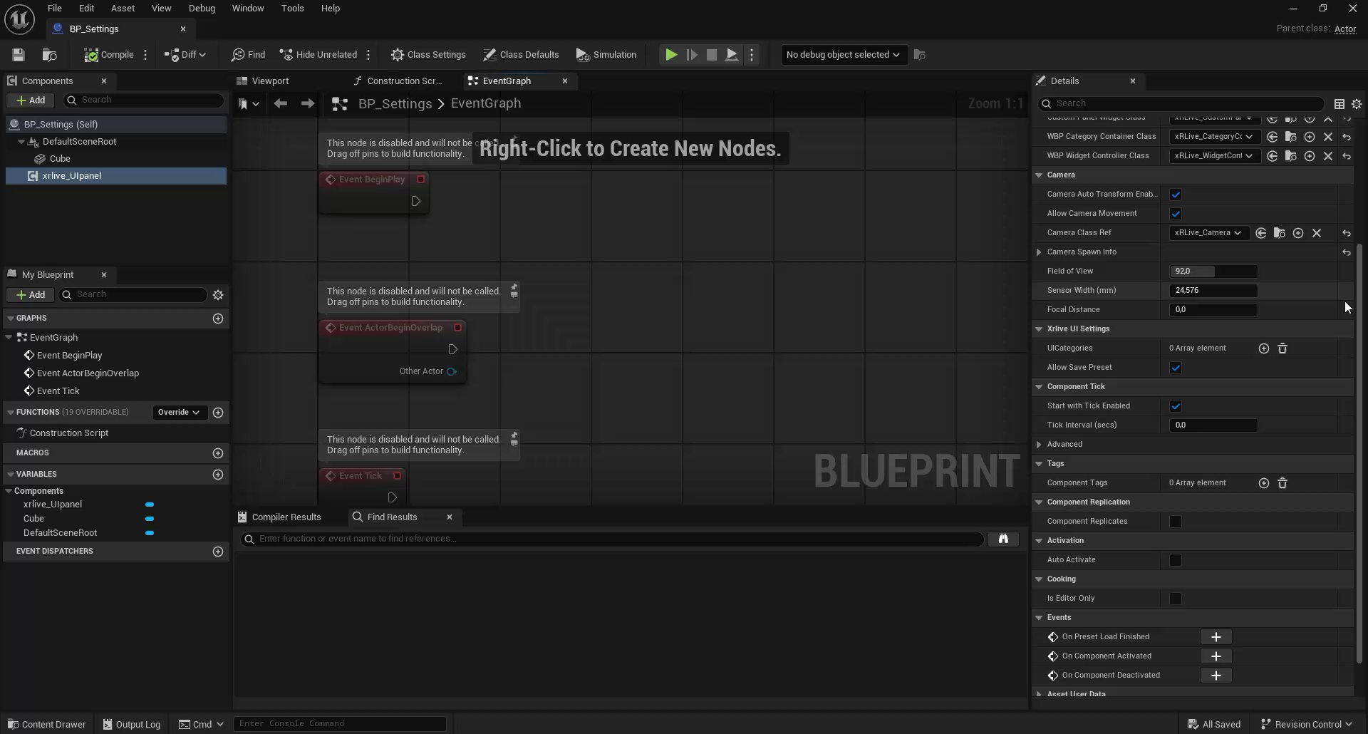
UICategories empty — the starting point before any category is added
Step 1 — Add the categories
Click the + button next toUICategories to add a new entry. Expand it and set the Category Name.
For this visual you need two categories:
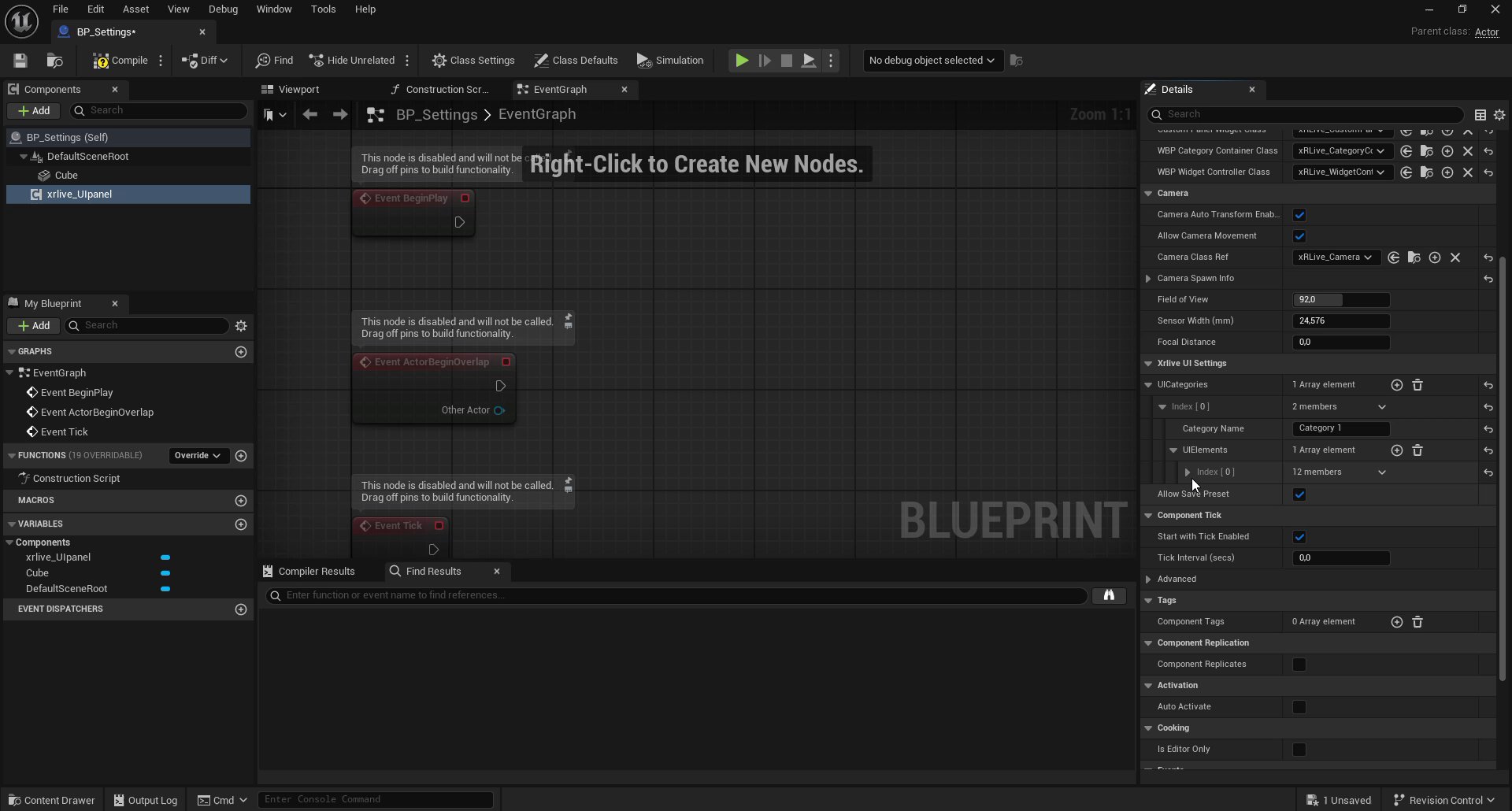
First category added — Category Name set and UIElements array ready to receive controls
The number of categories and controls is not limited to what this tutorial defines. You can add as many categories as your visual needs, and each category can hold as many controls as required. The structure shown here is simply what this particular visual uses.
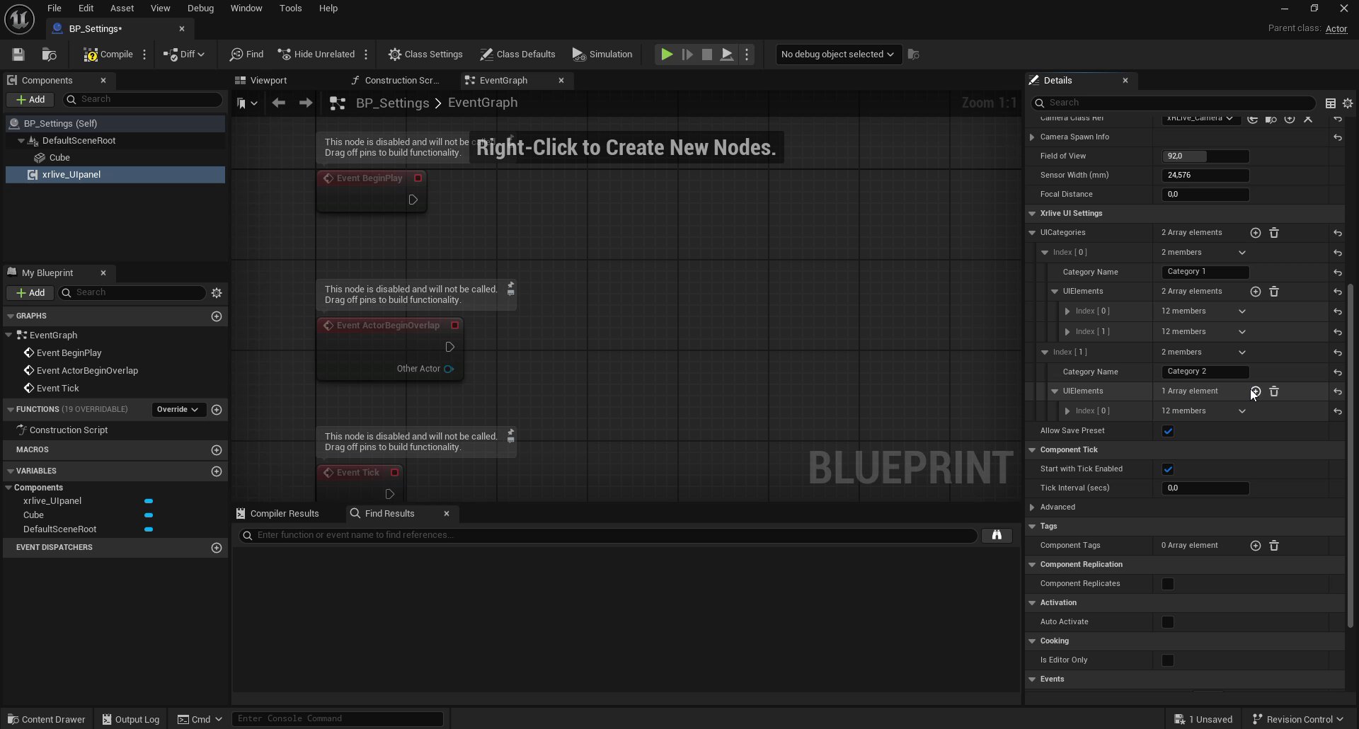
Both categories declared — Category 1 with 2 controls, Category 2 with 1 control already added
Step 2 — Add controls to Category 1
ExpandCategory 1 → UIElements and click + to add the first control. Expand the new entry and set:
- Type:
Xrlive Slider - Name:
Horizontal move - Slider Settings → Min Value:
-300 - Slider Settings → Max Value:
300
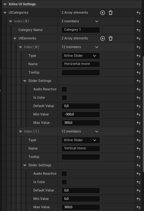
Slider control configured — Type set to Xrlive Slider, Name and range values filled
Category 1 → UIElements with the same slider settings but a different name:
- Type:
Xrlive Slider - Name:
Vertical move - Slider Settings → Min Value:
0 - Slider Settings → Max Value:
300
Step 3 — Add controls to Category 2
ExpandCategory 2 → UIElements and add three controls:
Visibility (Checkbox)
- Type:
Xrlive Checkbox - Name:
Visibility - Default Value Bool: enabled (checked)
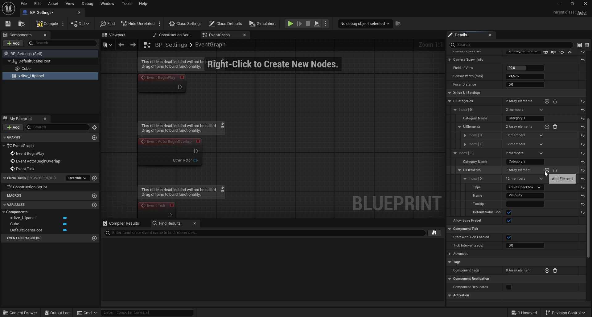
Checkbox control — Type Xrlive Checkbox, Name Visibility, default value true
Color (Color Picker)
- Type:
Xrlive Color Picker - Name:
Color - Default Color: any starting color (this tutorial uses magenta as a visible default)
Shape (Dropdown)
- Type:
Xrlive Dropdown - Name:
Shape - Dropdown Options: add three string entries —
Cube,Sphere,Cylinder - Selected Item:
Cube(the default mesh already in the scene)
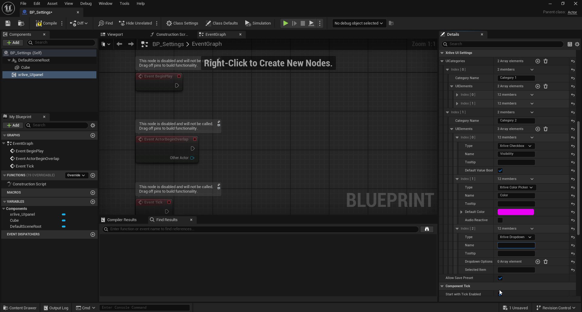
Category 2 complete — Checkbox, Color Picker, and Dropdown controls declared
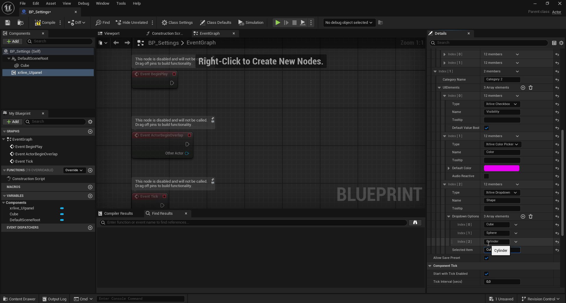
Dropdown options — Cube, Sphere, and Cylinder added as selectable items
Control types reference
The Type dropdown in eachUIElements entry maps directly to a UI component in the operator panel. The available types in this tutorial are:
For a full list of all available control types, see UI Components.
What you have now
UICategories is fully declared with:
- Category 1 —
Horizontal moveslider andVertical moveslider - Category 2 —
Visibilitycheckbox,Colorcolor picker, andShapedropdown (Cube / Sphere / Cylinder)
Wire Action Controller →
Connect each declared control to Blueprint logic so it drives the shape in real time.