> ## Documentation Index
> Fetch the complete documentation index at: https://xrlive.mintlify.site/llms.txt
> Use this file to discover all available pages before exploring further.
# Checkbox
> Boolean toggle that exposes a true/false state to Blueprint
A **Checkbox** exposes a boolean toggle to the operator. Each time the operator changes its state, Blueprint receives the new value through a bound event.
***
## Configuration
Checkboxes are declared inside `UICategories` on the `xrlive_UIpanel` component. Set **Type** to `Xrlive Checkbox` and fill in the fields below.
| Field | Type | Description |
| ----------------- | ------ | -------------------------------------------------------------------------------------------- |
| **Name** | String | Unique ID of the control. Must match exactly (case and spaces) when referenced in Blueprint. |
| **Tooltip** | String | Optional helper text shown to the operator on hover. |
| **Default Value** | Bool | The initial checked state when the visual loads. |
***
## Blueprint API
Call `Find Control by Name` on the `xrlive_UIpanel` reference, passing the checkbox's **Name**. Feed the **Return Value** into `Bind Event to On Check Change`. Create a **Custom Event** and connect it to the **Event** pin.
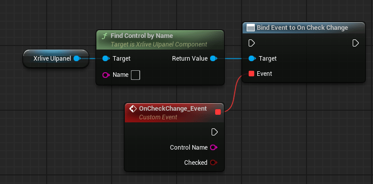 The custom event exposes two output pins:
| Pin | Type | Description |
| ---------------- | ------ | ------------------------------------------------------------------------------------------------- |
| **Control Name** | String | The name of the checkbox that fired the event. Useful when one event handles multiple checkboxes. |
| **Checked** | Bool | The current state of the checkbox. `true` when checked, `false` when unchecked. |
The custom event exposes two output pins:
| Pin | Type | Description |
| ---------------- | ------ | ------------------------------------------------------------------------------------------------- |
| **Control Name** | String | The name of the checkbox that fired the event. Useful when one event handles multiple checkboxes. |
| **Checked** | Bool | The current state of the checkbox. `true` when checked, `false` when unchecked. |