> ## Documentation Index
> Fetch the complete documentation index at: https://xrlive.mintlify.site/llms.txt
> Use this file to discover all available pages before exploring further.
# Define the Control List
> Declare operator control categories and controls inside UICategories
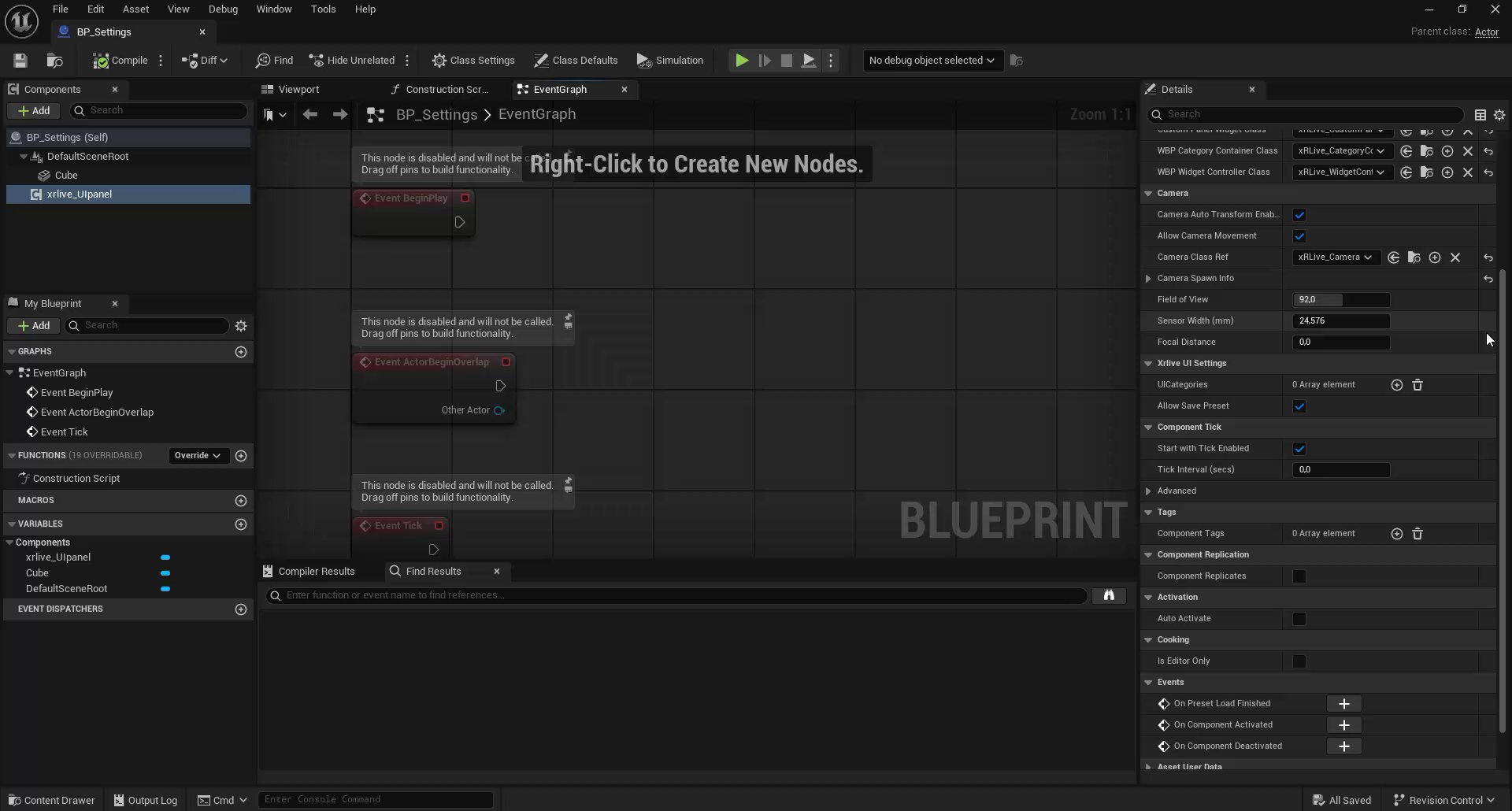
With `BP_Settings` and `xrlive_UIpanel` in place, this module covers how to declare the operator controls that will appear in the xRLive panel. All controls are defined inside the **UICategories** array in the `xrlive_UIpanel` Details panel — no Blueprint code is needed at this stage.
This module only covers declaring controls. Connecting them to Blueprint logic (so they actually move, hide, or recolor the shape) is covered in the next module, **Wire Slider Controls**.
## How UICategories is structured
`UICategories` is an array of **categories**. Each category has:
* A **Category Name** — the label that appears as a tab or section header in the operator panel
* A **UIElements** array — the list of controls inside that category
Each element in `UIElements` has a **Type** dropdown that determines which kind of control it is, a **Name** that the operator sees, an optional **Tooltip**, and type-specific settings (range for sliders, options for dropdowns, etc.).
 ***
## Step 1 — Add the categories
Click the **+** button next to `UICategories` to add a new entry. Expand it and set the **Category Name**.
For this visual you need two categories:
| Index | Category Name | Purpose |
| ----- | ------------- | -------------------------------------------------- |
| 0 | `Category 1` | Movement controls — the two position sliders |
| 1 | `Category 2` | Shape controls — visibility, color, and mesh shape |
***
## Step 1 — Add the categories
Click the **+** button next to `UICategories` to add a new entry. Expand it and set the **Category Name**.
For this visual you need two categories:
| Index | Category Name | Purpose |
| ----- | ------------- | -------------------------------------------------- |
| 0 | `Category 1` | Movement controls — the two position sliders |
| 1 | `Category 2` | Shape controls — visibility, color, and mesh shape |
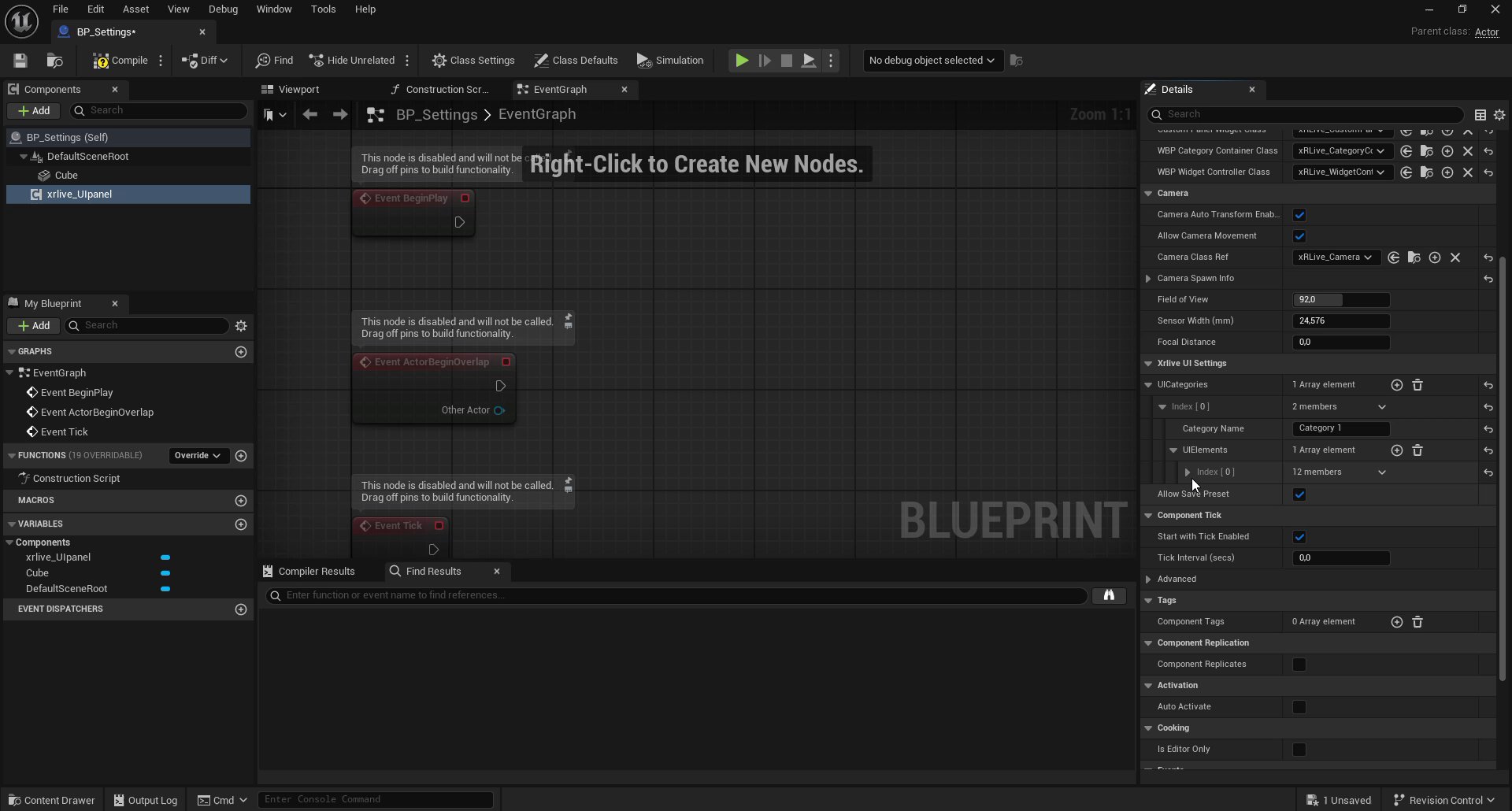 Repeat the process to add a second entry for Category 2.
The number of categories and controls is not limited to what this tutorial defines. You can add as many categories as your visual needs, and each category can hold as many controls as required. The structure shown here is simply what this particular visual uses.
Repeat the process to add a second entry for Category 2.
The number of categories and controls is not limited to what this tutorial defines. You can add as many categories as your visual needs, and each category can hold as many controls as required. The structure shown here is simply what this particular visual uses.
 ***
## Step 2 — Add controls to Category 1
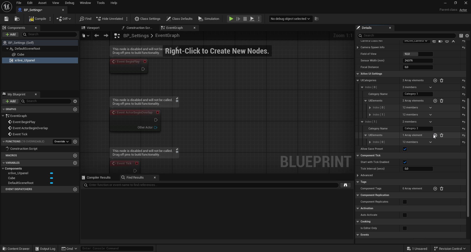
Expand `Category 1 → UIElements` and click **+** to add the first control. Expand the new entry and set:
* **Type:** `Xrlive Slider`
* **Name:** `Horizontal move`
* **Slider Settings → Min Value:** `-300`
* **Slider Settings → Max Value:** `300`
***
## Step 2 — Add controls to Category 1
Expand `Category 1 → UIElements` and click **+** to add the first control. Expand the new entry and set:
* **Type:** `Xrlive Slider`
* **Name:** `Horizontal move`
* **Slider Settings → Min Value:** `-300`
* **Slider Settings → Max Value:** `300`
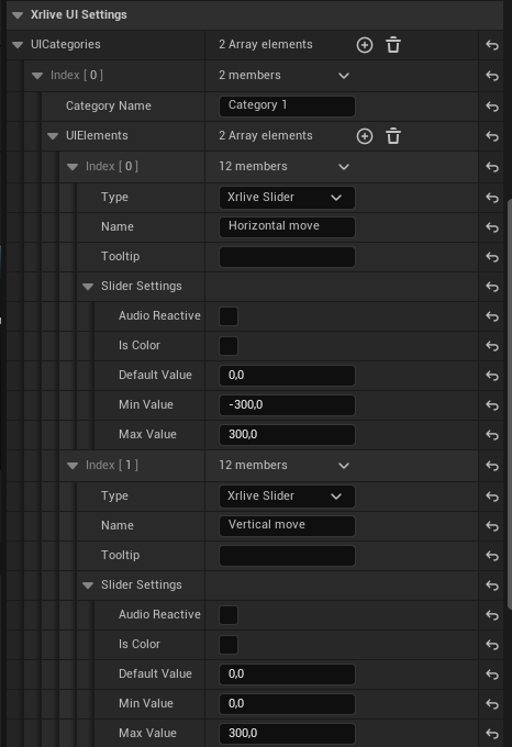 Add a second control to `Category 1 → UIElements` with the same slider settings but a different name:
* **Type:** `Xrlive Slider`
* **Name:** `Vertical move`
* **Slider Settings → Min Value:** `0`
* **Slider Settings → Max Value:** `300`
The **Name** field is the unique ID of each control. When the control is referenced anywhere in the system, the name must be written with the **exact same casing and spaces** as it was defined here — any difference will cause it not to be found. Additionally, no two controls across the entire visual should share the same name. While the system does not block duplicate names, having two or more controls with the same name will cause conflicts and both will stop working correctly.
***
## Step 3 — Add controls to Category 2
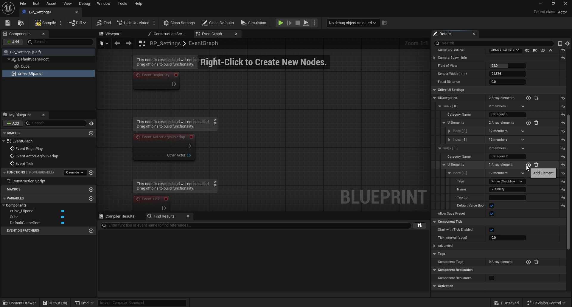
Expand `Category 2 → UIElements` and add three controls:
### Visibility (Checkbox)
* **Type:** `Xrlive Checkbox`
* **Name:** `Visibility`
* **Default Value Bool:** enabled (checked)
Add a second control to `Category 1 → UIElements` with the same slider settings but a different name:
* **Type:** `Xrlive Slider`
* **Name:** `Vertical move`
* **Slider Settings → Min Value:** `0`
* **Slider Settings → Max Value:** `300`
The **Name** field is the unique ID of each control. When the control is referenced anywhere in the system, the name must be written with the **exact same casing and spaces** as it was defined here — any difference will cause it not to be found. Additionally, no two controls across the entire visual should share the same name. While the system does not block duplicate names, having two or more controls with the same name will cause conflicts and both will stop working correctly.
***
## Step 3 — Add controls to Category 2
Expand `Category 2 → UIElements` and add three controls:
### Visibility (Checkbox)
* **Type:** `Xrlive Checkbox`
* **Name:** `Visibility`
* **Default Value Bool:** enabled (checked)
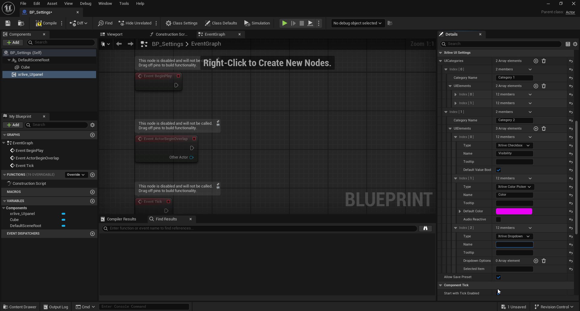
 ### Color (Color Picker)
* **Type:** `Xrlive Color Picker`
* **Name:** `Color`
* **Default Color:** any starting color (this tutorial uses magenta as a visible default)
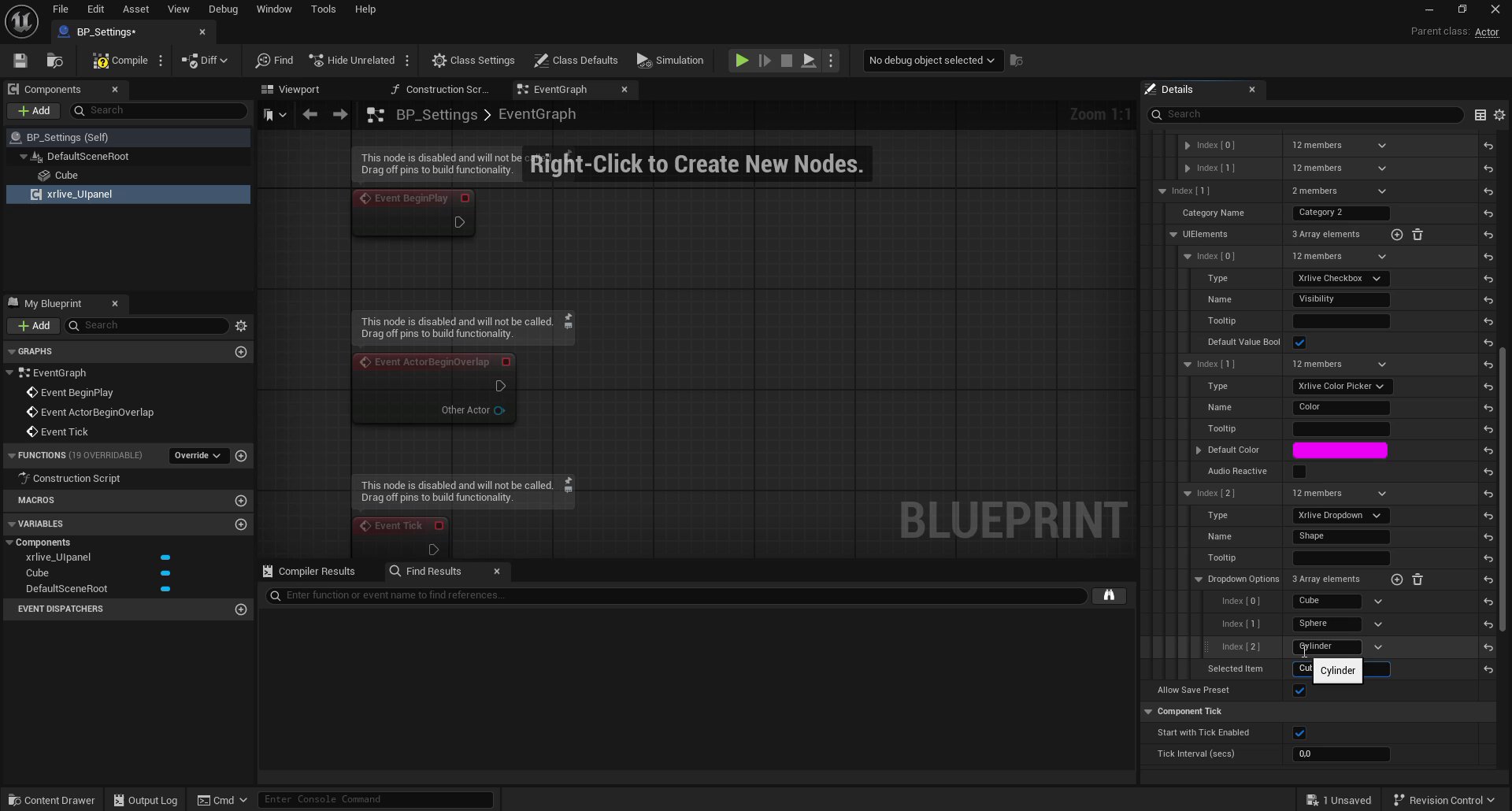
### Shape (Dropdown)
* **Type:** `Xrlive Dropdown`
* **Name:** `Shape`
* **Dropdown Options:** add three string entries — `Cube`, `Sphere`, `Cylinder`
* **Selected Item:** `Cube` (the default mesh already in the scene)
### Color (Color Picker)
* **Type:** `Xrlive Color Picker`
* **Name:** `Color`
* **Default Color:** any starting color (this tutorial uses magenta as a visible default)
### Shape (Dropdown)
* **Type:** `Xrlive Dropdown`
* **Name:** `Shape`
* **Dropdown Options:** add three string entries — `Cube`, `Sphere`, `Cylinder`
* **Selected Item:** `Cube` (the default mesh already in the scene)
 ***
## Control types reference
The **Type** dropdown in each `UIElements` entry maps directly to a UI component in the operator panel. The available types in this tutorial are:
| Type value | Component | Reference |
| --------------------- | ---------------------------------- | ----------------------------------------------- |
| `Xrlive Slider` | Float slider with min/max range | [Slider](/sdk/ui-components/slider) |
| `Xrlive Checkbox` | Boolean toggle | [Checkbox](/sdk/ui-components/checkbox) |
| `Xrlive Color Picker` | HSV color selector | [Color Picker](/sdk/ui-components/color-picker) |
| `Xrlive Dropdown` | Selection list with string options | [Dropdown](/sdk/ui-components/dropdown) |
For a full list of all available control types, see [UI Components](/sdk/ui-components/overview).
***
## What you have now
`UICategories` is fully declared with:
* **Category 1** — `Horizontal move` slider and `Vertical move` slider
* **Category 2** — `Visibility` checkbox, `Color` color picker, and `Shape` dropdown (Cube / Sphere / Cylinder)
When you run the visual, xRLive builds these controls in the operator panel automatically. The next module connects them to Blueprint logic so they actually drive the shape.
Connect each declared control to Blueprint logic so it drives the shape in real time.
***
## Control types reference
The **Type** dropdown in each `UIElements` entry maps directly to a UI component in the operator panel. The available types in this tutorial are:
| Type value | Component | Reference |
| --------------------- | ---------------------------------- | ----------------------------------------------- |
| `Xrlive Slider` | Float slider with min/max range | [Slider](/sdk/ui-components/slider) |
| `Xrlive Checkbox` | Boolean toggle | [Checkbox](/sdk/ui-components/checkbox) |
| `Xrlive Color Picker` | HSV color selector | [Color Picker](/sdk/ui-components/color-picker) |
| `Xrlive Dropdown` | Selection list with string options | [Dropdown](/sdk/ui-components/dropdown) |
For a full list of all available control types, see [UI Components](/sdk/ui-components/overview).
***
## What you have now
`UICategories` is fully declared with:
* **Category 1** — `Horizontal move` slider and `Vertical move` slider
* **Category 2** — `Visibility` checkbox, `Color` color picker, and `Shape` dropdown (Cube / Sphere / Cylinder)
When you run the visual, xRLive builds these controls in the operator panel automatically. The next module connects them to Blueprint logic so they actually drive the shape.
Connect each declared control to Blueprint logic so it drives the shape in real time.