> ## Documentation Index
> Fetch the complete documentation index at: https://xrlive.mintlify.site/llms.txt
> Use this file to discover all available pages before exploring further.
# Operator Controls
> Use sliders, buttons, color pickers, dropdowns, and checkboxes live on stage
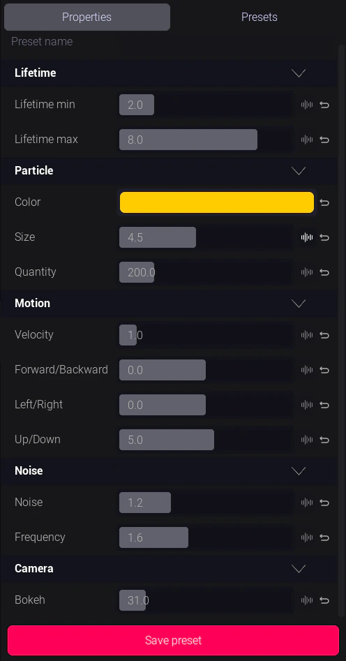
The operator control panel appears in the dashboard when a visual is running. Every control is defined by the visual creator — the set of controls you see is specific to that visual.
 ## Control types
### Slider
A float value you drag left or right between a minimum and maximum defined by the creator.
**Common uses:** Intensity, speed, blur amount, scale, opacity, effect strength.
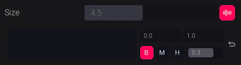
Some sliders are **audio-reactive** — they automatically respond to beat data from your audio feed and you don't need to move them manually. A wave icon indicates audio reactivity is active.
## Control types
### Slider
A float value you drag left or right between a minimum and maximum defined by the creator.
**Common uses:** Intensity, speed, blur amount, scale, opacity, effect strength.
Some sliders are **audio-reactive** — they automatically respond to beat data from your audio feed and you don't need to move them manually. A wave icon indicates audio reactivity is active.
 ***
### Button
A trigger that fires a one-shot event in the visual when clicked.
**Common uses:** Trigger a burst, start an animation, advance a state, fire a confetti particle effect.
Buttons are instant — no value to hold, just a press. Some buttons are momentary (fire on press, release on let go); most are single-click triggers.
***
### Checkbox
A boolean toggle — on or off.
**Common uses:** Enable/disable a visual layer, show/hide an element, toggle a loop.
***
### Dropdown
A list of named options. Click to expand and select one.
**Common uses:** Switch between scenes, change a theme, select a color palette, pick a font.
***
### Color Picker
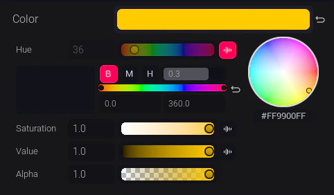
An HSV color selector. Drag the hue ring and the saturation/value square to pick a color.
**Common uses:** Change the primary color of a visual element, set a brand color live.
Like sliders, color pickers can be **audio-reactive** — individual H, S, or V channels can be wired to respond to beat data.
***
### Button
A trigger that fires a one-shot event in the visual when clicked.
**Common uses:** Trigger a burst, start an animation, advance a state, fire a confetti particle effect.
Buttons are instant — no value to hold, just a press. Some buttons are momentary (fire on press, release on let go); most are single-click triggers.
***
### Checkbox
A boolean toggle — on or off.
**Common uses:** Enable/disable a visual layer, show/hide an element, toggle a loop.
***
### Dropdown
A list of named options. Click to expand and select one.
**Common uses:** Switch between scenes, change a theme, select a color palette, pick a font.
***
### Color Picker
An HSV color selector. Drag the hue ring and the saturation/value square to pick a color.
**Common uses:** Change the primary color of a visual element, set a brand color live.
Like sliders, color pickers can be **audio-reactive** — individual H, S, or V channels can be wired to respond to beat data.
 ***
### Text Input
A free-text field. Type and confirm to push the value into the visual.
**Common uses:** Live score display, player names, custom messages on screen.
***
## Tips for live use
* **Practice your preset workflow** before a show — saving key control states as presets and recalling them is much faster than adjusting controls live. See [Presets](/launcher/visuals/presets).
* **Audio-reactive controls** don't need to be touched during the show — focus your attention on non-reactive controls.
* If a control doesn't respond, check that the visual is fully loaded (game window is rendering) and try refreshing the control panel from the visual settings.
***
### Text Input
A free-text field. Type and confirm to push the value into the visual.
**Common uses:** Live score display, player names, custom messages on screen.
***
## Tips for live use
* **Practice your preset workflow** before a show — saving key control states as presets and recalling them is much faster than adjusting controls live. See [Presets](/launcher/visuals/presets).
* **Audio-reactive controls** don't need to be touched during the show — focus your attention on non-reactive controls.
* If a control doesn't respond, check that the visual is fully loaded (game window is rendering) and try refreshing the control panel from the visual settings.